Devlog 6 - Updates and plans
Alright, this one probably should've been the UI one considering the amount of menus I've added but like, who knew what a little burst of motivation could do.
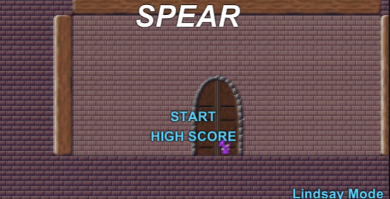
Title Screen

We're kicking off big, we've got a title screen, with a start button and a high scores button, and in case you wanna play without enemies, there's a button in the bottom right for you. They'll still exist, they'll just follow you around taunting you. (well, until you hit spikes and reset them)
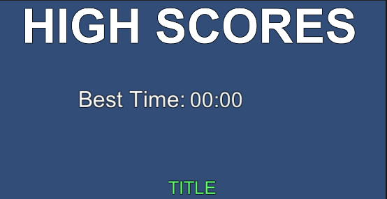
Some more screens

We've got a few more screens to talk about. We’ve got a high scores (well, high score) screen, that’ll (or at least it should) show the fastest time you’ve managed to get, starting at 166 minutes and 40 seconds. This is an arbitrary number, and not my best time, before any questions of my ability to play my own game are raised. (It’s at 00:00 in the screenshot as I took in in the unity editor)

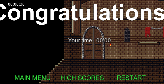
And an end of game screen! It’s a little messy, but it’ll show you your final time (because the regular timer keeps going up) and provide you some ways to get around the game once you’re done, whether you wanna restart, go to the high score screen, or just go back to the title. Accidentally made it so that in Lindsay Mode, if you hit reset, it’ll just take you to the regular game. Whoops.
Level 2
Level 2 is functional, but I wish I had spent a bit more time on it. Some angles to jump off though, so that’s fun.
End goal
We have an ending, too! If the end of game screen didn’t give it away. The sprite for the goal is just a jar of milk. Who left that out of the fridge…
Now for some planned things:
I’m hoping to be able to revisit the swinging controls, sometime soon. These are finicky at the best of times, and the feedback session that was run for SPEAR showed that they’re pretty hard to get working the way that players want them to.
Also, there’s hope to get rid of the spear-activating-and-breaking-immediately bug that I don’t seem to be able to rectify no matter how hard I try.
Sounds and lighting are both things that I ran out of time to add, that I think would really add to the aesthetic of the game. Maybe add some stars or something simple as a parallax background to go with lighting for a really nice atmosphere.
We shifted the enemies around based on feedback from the session, as well. That lad that was directly next to a checkpoint is no longer, in fact, directly next to a checkpoint.
Sorry for the lack of gifs in this devlog! Just figured it was easier to do images, and not have to worry about the gifs suddenly jumping to 8000 MB in size because I recorded a second too long.
SPEAR
Swinging and Swoovin'
| Status | In development |
| Author | Helidara |
| Genre | Platformer |
More posts
- User GuideOct 17, 2021
- Game DocumentationOct 17, 2021
- User Interface and Polish - Devlog 5Oct 10, 2021
- Game TestingOct 07, 2021
- Graphics and Enemies - Devlog 4Oct 07, 2021
- Puzzles and Hazards – Devlog 3Sep 26, 2021
- Level Blocking - Devlog 2Sep 19, 2021
- Player Movement - Devlog 1Sep 12, 2021
- Concept DevlogAug 29, 2021